

Simplifying the Student Learning Experience: How Students Navigate Courses
UX/UI Design
Role
Product (UX/UI) Design
Team
Myself;
1 design manager (Kelvin);
1 customer service lead (Maria);
2 engineers (Gwyn, Alex)
Year
2022
Brief
Since our initial launch of our student dashboard MVP, our student base grew to 1mil+ registered students.
To figure out common pain points, I talked to our Customer Service Lead to figure out the most common dashboard questions students emailed them with.
We found students had confusions over program/course information, as well as where to find certain things.
With my team, I decided to improve their navigation experience and make information clearer.

Some screens from our updated dashboard designs.
Problem Space
Talking to Customer Service, we found that they received a significant number of emails on program information (e.g. “What courses are required to graduate?”) as well as course navigation (e.g. “How do I find my certificate?”).
Looking at the previous dashboard design, we also found different usability issues:
Complicated navigation: “My Courses” and “My Certifications” had duplicated information, since certifications consisted of courses.
Lack of focus: Pages contained a lot of information, but had no clear call to action.
Lack of hierarchical relevance: From the main navigation, students are shown information about all available programs (even ones they were not enrolled in). This could make students feel overwhelmed — there is a lot of information, but not all of that is relevant to the student.

Old Certification Overview page for enrolled students.

Old Certification Overview page for un-enrolled students.

Old program page for enrolled students.

Old program page for un-enrolled students.
Here, we have an opportunity:
How might we improve our dashboard to be simple, focused, and relevant, so students can easily find the content they want, while decreasing emails and workload for our Student Support team?
We explored different solutions:
Creating an onboarding flow to help students navigate the dashboard better
Adding search/filter functionality in the program page, so students can find specific courses
Updating and simplifying our information architecture and sidebar navigation
Ultimately, we decided the root of the issue was in our information architecture. Even though it would be a larger project, it would actually solve the root of the issue.
Revisiting Information Architecture
The most prominent change was our information architecture.
“My Courses” and “My Certifications” had duplicated information. Instead of showing details on courses, we combined the information under “My Courses” and categorized learning by time. This made content relevant for students, instead of showing all programs.

Updated information architecture for dashboard navigation.
We modified the user flow to show the most relevant information for the student.

OLD user flow had repeated information in different categories and showed students all programs. This was unclear and not as relevant for the student.
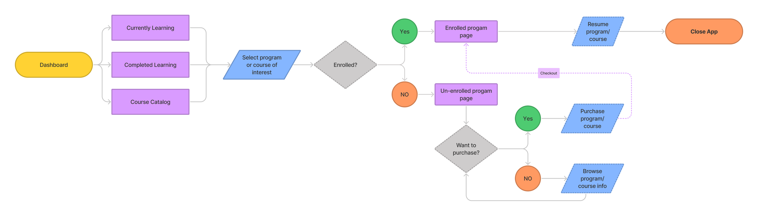
REVISED user flow shows students the most relevant information based on where they are in their learning journey.
On the student side: a simplified, relevant sidebar to navigate courses.


Showing Relevant Modules
Depending on where the student was in their learning progress, we updated the states of the dashboard to show different modular items.
We created these different states for both the homepage and the program page.
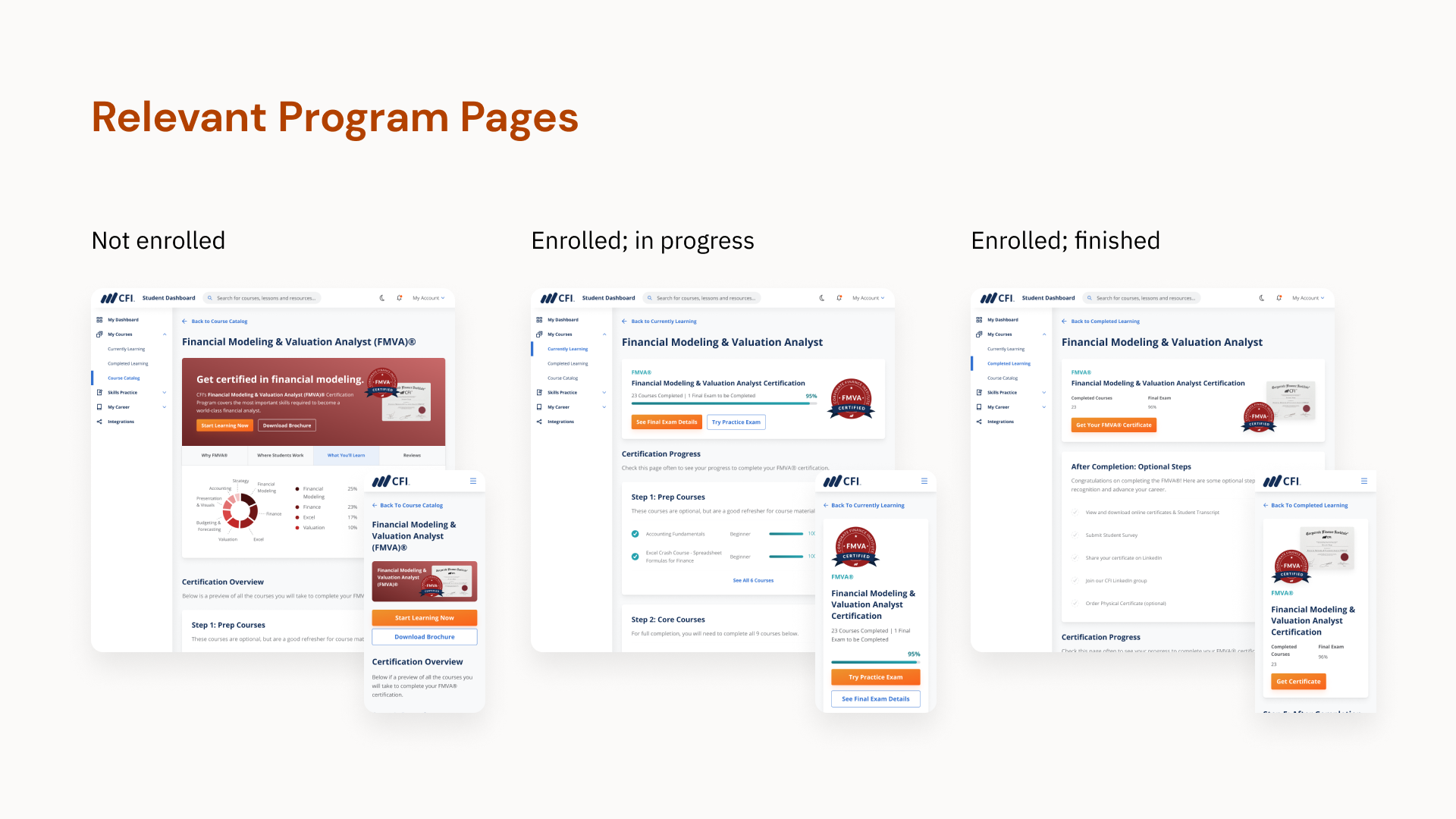
Program card states for potential students
For potential students, the program card focused on the specific program brand colour, as well as tabs for information on the program. We hid progress, since it wasn’t relevant for potential students.


Program states for enrolled students
For enrolled students, it was less important to be flashy with information. We showed a simple progress bar, with different states depending on where the student was in their journey. The CTA also changed depending on what was most important in the specific stage of the student journey.

Program card — state 1: In progress

Program card — state 2: Courses completed, exam to be completed

Program card — state 3: Exam to be graded

Program card — state 4: Exam failed

Program card — state 5: Exam passed

Program card — state 6: Program completed
Final Designs and Flows — showing the most relevant & clear learning experience
Here are a few final designs for the courses area.
The courses are separated into course catalog, currently learning and completed learning, providing students the relevant experience based on their learning status.
The program page is also clearer and more consolidated: it now contains all information previously on both “My Courses” and “My Certifications” pages, and reduces the # of clicks necessary to find information on navigating to courses, what’s needed in the certification, how to find certificates, and more.

Modifying our flows
Going back to our initial problem, the main tasks students needed to do were:
1) continue learning
2) explore courses
3) get their certificate
To test these flows, we internally tested in our company. If we had more resources, I would recommend reaching out to enthusiastic students for a beta testing list and conducting a usability test to see their actual experience and pain points. In the end, we finalized upon these flows that allow students to complete tasks with minimal clicks in a clear way.


Results
After launching the design changes, we found an ~95% decrease in related emails that Customer Service received.
This not only saved time for our Customer Service team, but also
Improved information clarity on the student dashboard and alleviated prior confusion for our students
From our design changes, the student learning experience and navigation on dashboard is now clearer, more focused, and relevant to the student.
Next steps
Although the project is a success, improving the dashboard is a continuous process.
For potential next steps, I’d gather more quantitative and qualitative data to uncover more opportunities.
Qualitative Data: We’re building out a beta testing list of actual students. This allows us to conduct usability testing for specific tasks (e.g. how students navigate to different courses, how they find certificates), and uncover pain points and new opportunities.
Quantitative Data: We’re working with our data scientist to build in quantitative tools allowing heat maps, A/B testing, etc. for the dashboard. We currently use Clarity for analyzing website heat maps and click rates, but we still have to implement that for the student dashboard.

Thanks for reading!
Related Projects:

Building out CFI’s Design System
Designing a component-based library for CFI.