

Building a comprehensive, component-based design system for a growing online education company
CFI Education
Team:
Myself;
3 product designers (Bettsina, Diana, Kelvin);
1 graphic designer (Adri);
1 engineer lead (Gwyn)
Role:
Co-spearheaded with Bettsina (Lead Designer); project lead after Bettsina left company
Design System, UI Design, Style Guidelines, Branding, Design Documentation
Year:
2019–2022
Tools:
Figma
Problem Space
When I joined CFI as their second designer, the design culture was still quite young. The focus was more on quickly producing products and content, to validate business ideas, rather than fully refining designs. As a result, the site was constantly changing and had inconsistent design styles.
As our company grew, we needed a system to establish and elevate the style of our past, current, and future UI designs.

Enter CFI 3.0
To help establish brand trust, ensure visual consistency and facilitate the communication between designers and developers, we decided to work on a component-based design system.
I consolidated different components throughout the site— and worked with our lead designer to cut down on inconsistent styles and establish specific guidelines.
Our design system right now is a living design system, a bridge between designers & developers. It’s sped up our workflow immensely.
Here is a sample of our design system.

A snapshot of our working design system.
A sample of what’s included —
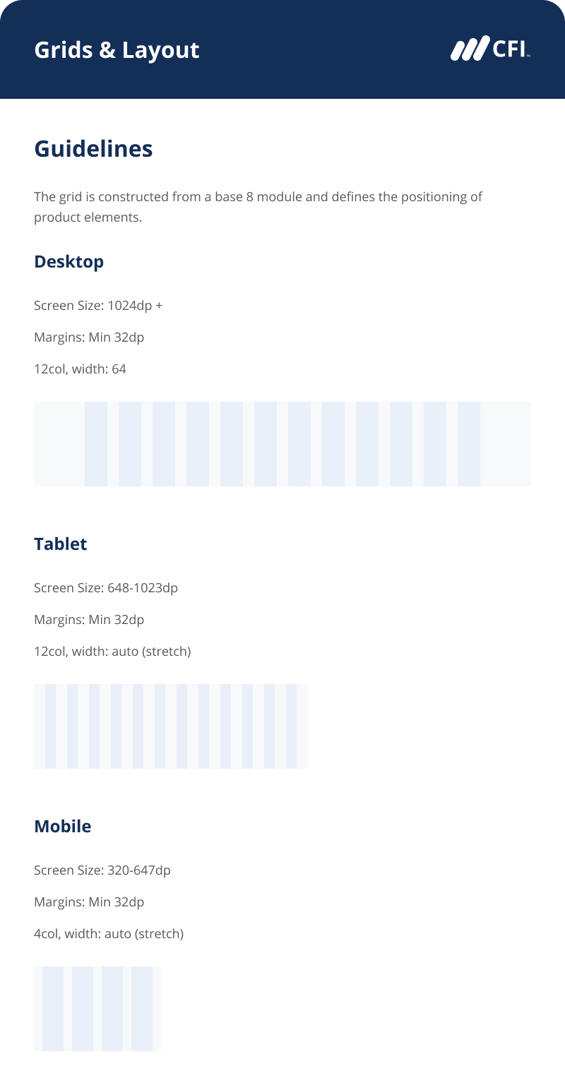
Spacing/Margins
I helped establish an 8pt grid to create consistent spacing in UI displays. The 8pt grid then defines our dimensions, padding, and margins of both block and inline elements.
We then created specific spacing options, to have more consistency and eliminate arbitrary decisions. Collaborating with our lead designer, and communicating with our developer, I built out rules and guidelines for specific sizes, as well as use cases for each margin or padding.
These guidelines would also be defined in the code to reduce coding time.

Typography
We refined our typography to a few select header and paragraph sizes, and included usage guidelines.


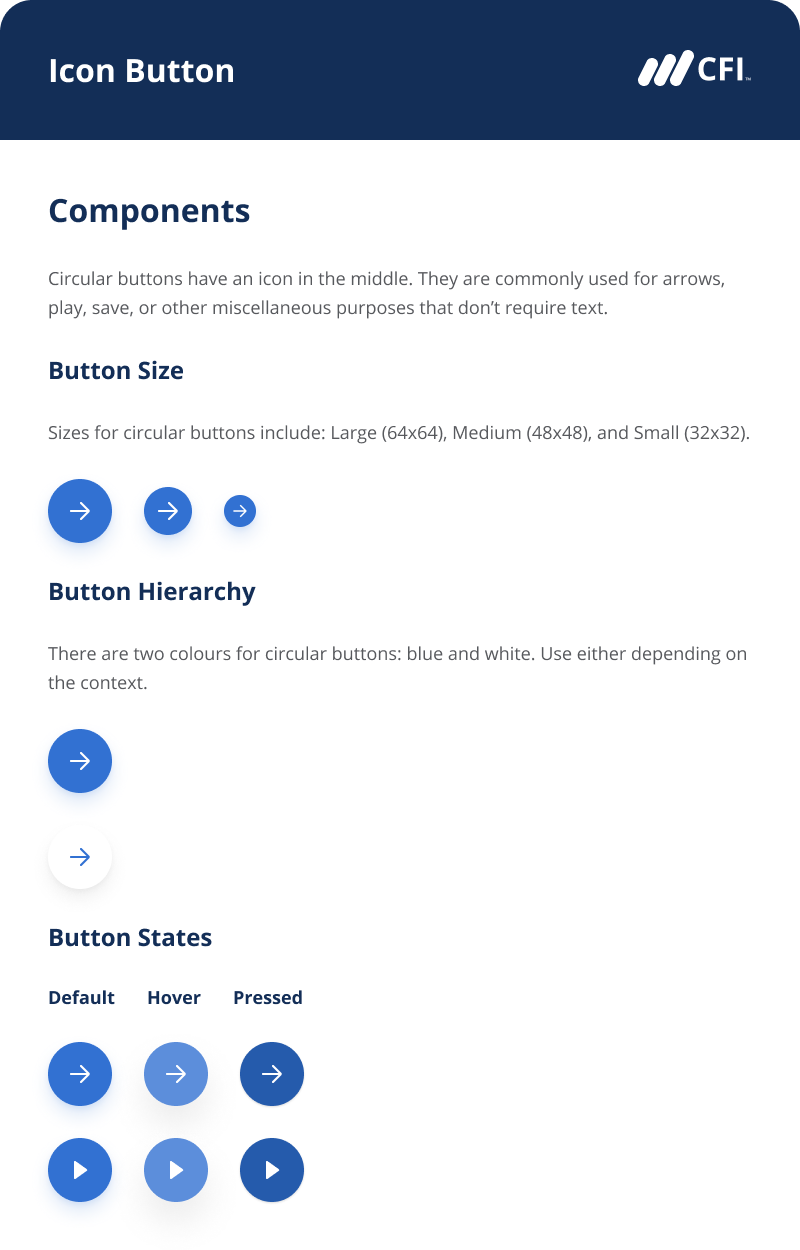
Buttons and Links
To make buttons and links consistent, we created specific sizes and logic to the hierarchy of primary buttons, secondary buttons, and links.


Forms and Input
Here are some snippets of forms and input components.


Takeaways —
Start atomic, and build up.
To ensure consistency and maintainability in our design system, we applied Brad Frost’s atomic design principles to our design system.
Each component consists of more atomic components. An example of this is in our dropdown component.
Dropdowns
To create the dropdown, we first broke it down to smaller components: each row contained either a dropdown cell or input element. We first designed cell components (including different states). Then, we combined multiple cell component instances, in addition to some input instances, to form a dropdown.


Going atomic— design systems should be atomic enough to be flexible.
Creating guidelines with flexibility, not rigid rules.
i.e. Knowing when components are too constraining
Cards
Cards are something we use across the site. I had the most fun doing this— it was satisfying refining them so they were all more visually cohesive.
However, in demanding visual cohesion, we later figured out that our rules for cards were too strict. We needed lots of different cards, each for their own use case.

However, as we tried to design card components, we realized there were a ton of different use cases for the cards! Every card had different content, and one card component wasn’t going to cut it.

As time went on, we realized that we didn’t want our components to be restrictive, but rather encourage flexibility.
Cards were something that, if made into a strict component, seemed to constrain designers more than empower them.
Instead, we decided to create card guidelines that encouraged flexibility, empowered the designer, but still matched our design system.
To solve this, we established a specific card anatomy and guidelines for consistent use of text styles and spacing. We broke down the different properties of a card, and provided different options for each property for designers to choose from. This allowed consistency, but also flexibility.

Choose helpful naming conventions.
As our design system and team grew, we discovered the importance of component organization.

When analyzing how designers used the design system in their daily work, two cases came up for us repeatedly:
1) How designers find components to use, and
2) How designers replace current instances with variants
We found that designers use the “search” function to find components to use, and replace current instances through Figma’s swap instance functionality.
Thus, we decided to focus on creating good naming conventions in order for designers to efficiently find and replace component instances.
To do this, we listed out all instance properties for each component, and decided property hierarchy and what was important as a way for designers to navigate.
We implemented consistent naming convention formats for each component

Tackle the right balance between usability and maintainability.
For instance, base components are easy to maintain, but may be unintuitive to use.
When I first onboarded our junior designers in the design system, they didn’t understand base components and would try to change the instance within the base component layer.
As an immediate solution, I:
Trained designers on base components and instances.
For a future solution, I’d recommend to
Create standard onboarding documentation
Re-structure base components (and use better naming conventions) so they’re distinct from usable components
Impactful Results
Since building out our design system, we’ve had amazing results for our team:
Increased design productivity by >400%.
Consistent and reusable design components allowed our design efficiency to skyrocket, since we had a shared language with designers and developers.
A design that would take us 2 days in the past would take 2 hours instead.
The saved time and established UI structure allowed us to spend time exercising more creativity in our UX design solutions.Cleaner handoff with Designers & Engineers.
Having a single source of design truth with atomic design elements creates a cleaner handoff process, as engineers are able to immediately gather the right information to also create clean, modular code. This project also pushed developers to go through a major code refactoring so the components are as modular as the designs.
There is now less back-and-forth between designers and engineers.Faster and clearer on-boarding and training for new designers.
With the comprehensive documentation and source of truth, we improved our on-boarding and training process for future designers. This became useful as we hired more designers and doubled our team later on.

Overall Takeaways
Start atomic, then build up.
Before working on larger components or even pages, start with decisions from an atomic scale. When you have a solid foundation of building blocks, it’s much easier to align on complex components later on.Design systems are interconnected and complex.
The end results have a sense of straightforward simplicity, but it’s a winding process to get there. Lots of experimentation, discussion, and, most importantly, ensuring visual cohesion between everything.
Everything is connected—for instance, refining designs for cards may impact spacing guidelines, which would then change designs for anything that’s impacted (input forms, hero sections, etc.).Design systems take a lot of time and effort upfront — but saves us time and effort in the long-term.
Working on this design system gave our team immense value. It not only improved our UI but also improved our process and communication within the Design & Development team.
I highly recommend establishing a Design System, even with a Design team as small as two designers.It’s not only about creation, it’s also about maintenance.
The design system is a continual work in progress. Having grown my design team and introduce new members, we’re constantly maintaining our components to fit different use cases. There’s always a balance between maintainability and usability in how you design your components.
Thanks for reading!
Related Projects:

Making a clearer, focused and relevant student learning experience
Improving the dashboard for a better student experience.