Launching Wave’s new mobile app
UX/UI Design
Role
Product (UX/UI) Design
Team
2 mobile product designers (me and Jaclyne);
1 director of design;
3 feature product designers;
1 product manager (Alex);
1 research lead (Josh);
16 engineers
Year
2022
Overview
Before this project, Wave’s ecosystem consisted of a web app for small business owners to manage their finances (invoices, online payments, expense transactions, and more), alongside outdated mobile apps for invoicing and banking. This fragmented experience posed a challenge for small business owners, who needed a more streamlined solution to manage their finances on the go.
We set out to create a new, all-in-one mobile app that integrated invoicing, online payments, banking, and more into a single, cohesive platform. Not only was this helpful for users as it allowed them to access everything on the go, but this was essential to Wave’s broader product vision, as it allowed for future developments.
The new mobile app: a prototype walkthrough of the different tabs.
My role
I focused on the research and design of the invoicing and payments features. My goal was to create a seamless experience for users to create, send, and manage their invoices, while also enabling them to receive, record, and manage their online payments.
As the mobile designer, I also collaborated closely with other feature designers (who were working on other features, such as the dashboard, onboarding, online banking, and settings) to ensure our mobile designs were cohesive with each other, and fit with our mobile design system.
Allowing users to create a new invoice with existing customer and item data. This is a happy flow, but I designed for many more unhappy flows and edge cases.
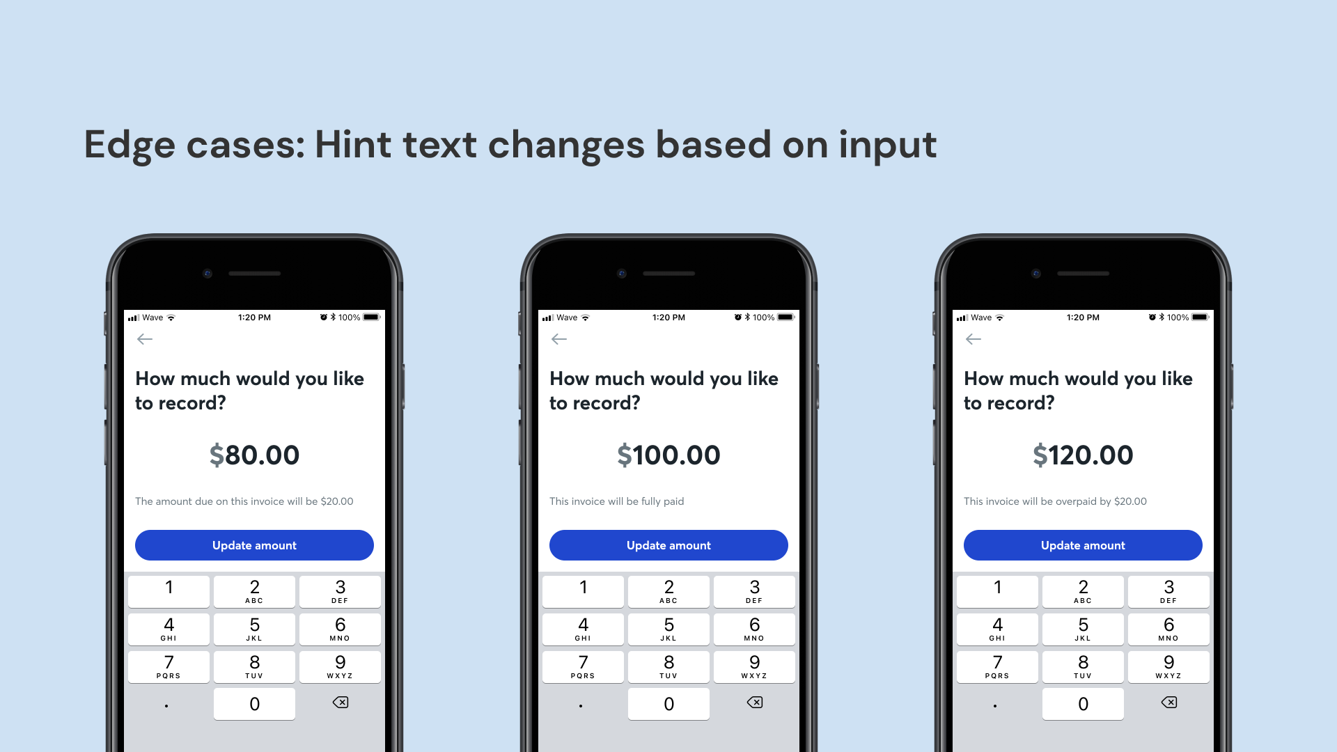
I collaborated with engineers to discover and design optimal solutions for specific edge cases.
More granular edge cases for editing a manual payment. The screen’s hint text changes based on the user’s situation and inputs, so that it is most relevant and clear for the user.
These features had gone through several rounds of iteration, from insights gained from usability tests, design jams with the design team, and PM & engineering feedback on edge cases and scope. (For more details, please reach out to me directly.)
Results and impact
The mobile app launch was a success, leading to a 10% increase in monthly active users compared to the previous Invoicing app.
Post-launch, I collaborated with our head of research to conduct user research, aimed at identifying opportunity areas of improvement. This included tagging and analyzing 200+ pieces of user feedback through bug reports and reviews, as well as conducting in-depth user interviews.
Our research uncovered valuable insights, including usability enhancements and three critical feature requests that users urgently needed. We brought these findings to the leadership team, which ultimately influenced and shaped our product roadmap.
This is a tiny sample of my work. If you’d like to learn more, please reach out directly.
Thanks for reading!
Related Projects:
Monetizing Wave’s mobile app
Designing our monetization strategy for Wave’s mobile app.


