
HAVEN —
Product Design, Mobile UI, Brand Identity, Graphic Design, Web Design
HAVEN is an in-room, press-and-play guided meditation system to help busy, stressed workers recharge.
We created it within 13 weeks of agile prototyping at the Centre for Digital Media.
In a cross-functional team of seven, I was both the designer and developer: in charge of coding its connection to the Philips Hue API with Javascript, as well as creating its brand identity, graphic and web design, and mobile UI mockups.
Agile Prototyping & Iterating
To design and test our product, we had one-week sprints. We followed a scrum methodology — every sprint, we would design, prototype and test a Minimum Viable Product, then iterate on the design based on user test feedback.
Throughout this, we also additionally created user journey frameworks, prepared weekly presentation decks, presented to cohort members and industry, iterated on our brand identity, designed marketing materials, and developed the actual implementation and functionality of the app. To read about our process in more detail, check out our blog.
Brand
When creating our brand, we kept coming back to our target user: stressed students needing a quick break.
With stressed students, we wanted our interfaces to be soothing, friendly, and accessible.
We kept coming back to these brand values when creating our designs. After several rounds of iteration, we found that muted pastel colours, roundness (bubbles, round type, round corners), and nature themes suited our interfaces best.
Web Design
To help people find out more about HAVEN, we decided to have an informative landing webpage.
Here, I created a mock of our one-page landing page. The prototype was a scrollable JPG image, created for a specific iPad display outside our meditation room.
We wanted our landing page to incorporate the same brand identity as our mobile app, so I included the faded circles and bubbles to not only tie in the coloured lights of the HAVEN experience, and also emulate a soft, fun and accessible atmosphere to draw people in.
Mobile UI
To engage our users before and after the meditation experience, we created a mobile app for users, primarily to act as a booking system to book the physical meditation room.
In collaboration with our primary UX designer, I created our mobile UI mockups. I took his bare-bone no-styling wireframes, spiced it up with styles and spacing, and incorporated our brand elements.
The end result is a friendly, intuitive booking system. The design elements do not distract, and instead, draw the eye to where the user is supposed to click, creating a seamless experience.
We used Sketch and Adobe XD to create this mobile prototype. Here are a few snapshots of some screens.

Our landing page for our mobile app.

The menu bar popup.

Users are prompted to pick a time for their reservation.

Users can then choose the meditation mode they want.

Confirmation page; users also see the reservation code to use the meditation room.

A congratulatory page.
Promotional Materials
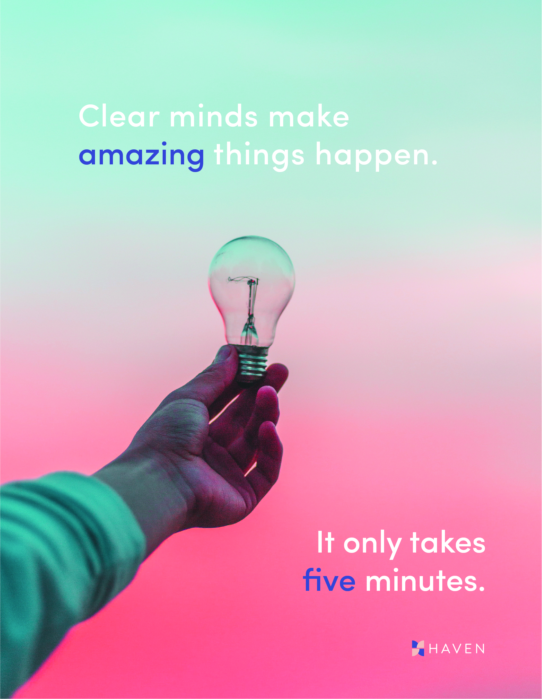
Throughout the thirteen weeks, I was constantly creating promotional materials for HAVEN, whether for banners, general marketing, or campaigning for a specific launch date.
As our brand values intentionality, inclusivity and simplicity, I incorporated sky and nature in our visuals: colour gradients of still skies, as well as muted colours and minimal copy for effective messaging.

Our initial banner.
The copy was constantly changing, so I had to design posters flexible for these changes.

This was our final copy.

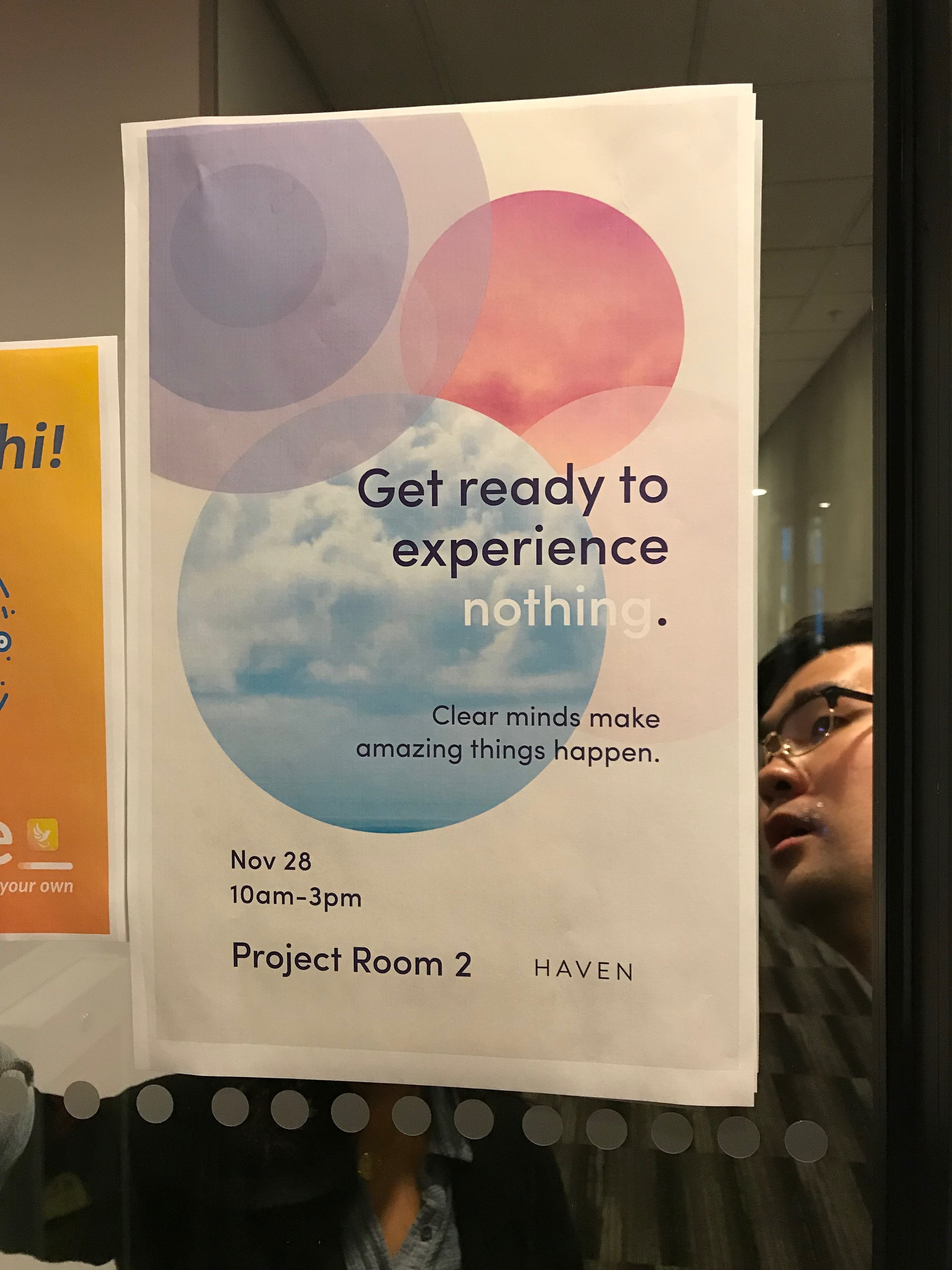
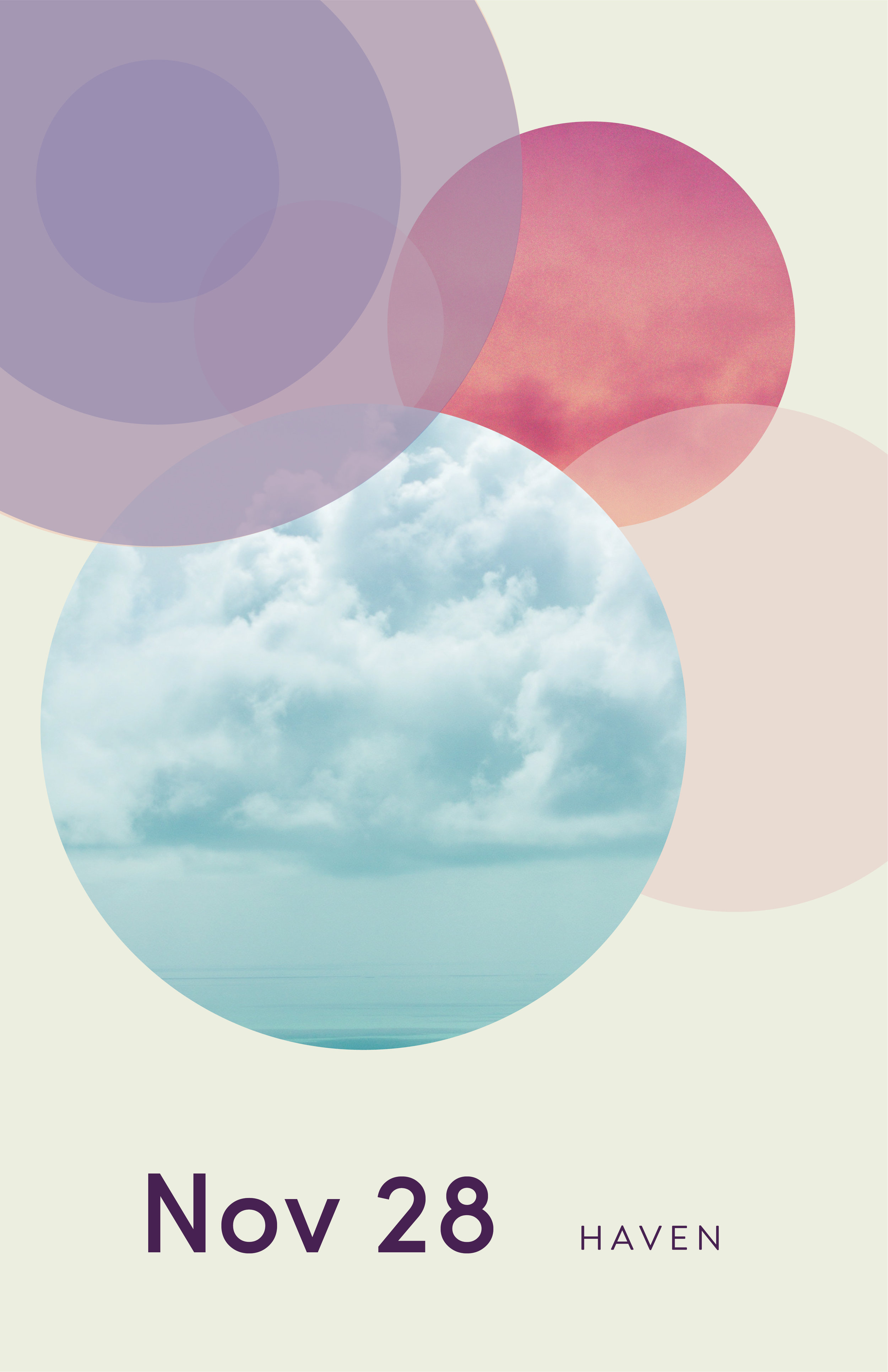
One of our final releases was on November 28, so we created an awareness campaign around our launch. This included different posters for print, social media, TV banners.

I created different posters for our 11/28 launch date — I used nature elements and went with a minimal feel. Here, I used bold text and blended the textures of the text with the background image of water. We ended up not using this poster, as the turbulent waves did not reflect the calming nature of HAVEN.

Again, this poster was deemed to be too ominous. We wanted something calmer, emulating stillness.

This was a little better; but the cloudiness did not match the copy of a still mind.

We ended up going as minimal as we could — choosing a gradient that emulated a sunset sky, with just the anticipation of a specific date. Since our target audience consisted of students who already knew our product and had a good knowledge of what was happening, this poster was efficient and effective.
We also created posters that matched the style of our landing page mockup and phone booking app prototype.


We circulated these promotional materials digitally — on social media, emails, TV banners — as well as printed.